
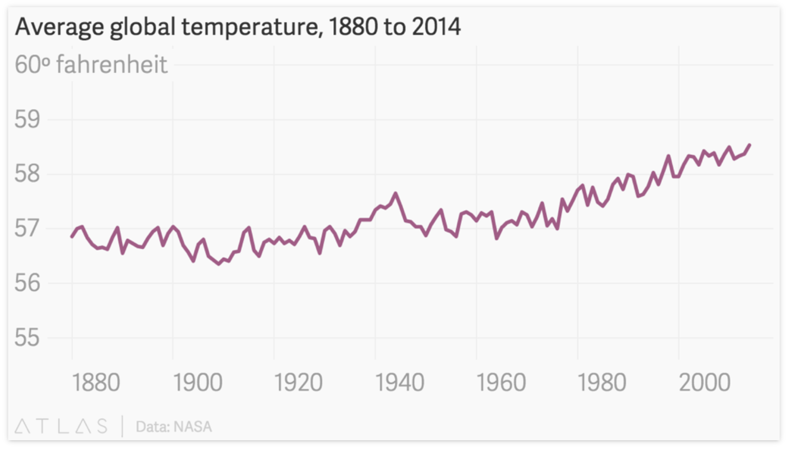
“You just have to look at the data over history to understand that nothing is changing regarding global warming.” Then, my seatmate shared a graph on their iPad. A quick Google search revealed that the image was considered one of the most misrepresented global temperature graphics from 2015 (note the Y axis ranges from -10 to 110 degrees F). A quick Google search revealed a different version.
This is not a debate over global warming trends or historical temperature fluctuations. It is a reminder that presented data can lack fidelity and immediately generate an emotional response. We feel shame or inadequacy that we did not know such a central fact when, in reality, the fact is not really what it appears.
How might we remain curious despite the headlines we encounter? How might we read more, ask better questions, and seek other resources before reaching our own conclusions? Other people may have traveled the same route, but their experience does not mean that we have to serve as their proxy.
